I love the story behind this. And you're right - just as beauty is in the eye of the beholder, so is garish. Seeing where you started with this helps us realize that for this image, this is a garish presentation. Thanks.
Penny Street
I think you're right. This version only seems garish to me because I have benefit of having seen the original scene and the unprocessed shot. So what seemed pretty garish (due to the difference from the processing) actually ends up looking kind of tame.
I may have to revisit this to see if I can spice it up a bit :)
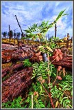
Here's the more-or-less "original" way this shot looked. It was taken in an area of forest that had burned a few years ago and it was totally overcast, and had just started to rain when I shot it. I used the pop-up flash on the camera to try to get some light on the plants in the foreground. It was kind of an experiment that didn't work.
But when processed wildly, it kind of equalized things out a bit. But the problem is that the fallen trees end up looking too "alive" when the original point was to show the contrast between the bright, vibrant, living, new plants and the burned, dead, fallen trees.
Part of what gives it a painterly quality is that I had to compress this at quality zero (!) in photoshop to get it down under the challenge file size. And that adds to the odd processing feel, I think. The "non processed" version only needed to be saved at a JPG quality of 7 out of photoshop to get it down to size.
And, I'm cheating here, too. I bought a copy of Topaz Adjust in order to get a free copy of Topaz Denoise (adjust with denoise was cheap at that point). And since I've got it, I've been playing with it. So most of what you're seeing as the adjustments was done with Topaz Adjust.
Sorry for the long post, but I'm having some fun with all of this :)
And thanks for the comment because I think you're right on with it!
Interesting shot Jim because it seems to have a 'pastel.. painterly' appearance even though it has some 'extreme' processing. This tends to make it more subdued than might have been intended.
Probably a higher contrast setting might produce a more 'garish'... 'in-your-face- appearance which I interpret this theme to be aiming toward. (But then that is just my opinion and my interpretation)