Commenting on this page requires full PBase membership.
Please login or register.
SWEngineer
26-Jan-2006 01:50
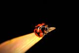
Hi Steve. As you asked... Overall, I like the shot, but I see some things to consider for improvement: You need more separation of the dark patches of the bug's shell against the overlapping black background. The ring highlight on the shell is kind of distracting. There's too much black background, and the bug is too close to center for an effective composition, especially against this large negative space. On the plus side, your DOF selection works well as does the title. All this IMHO, of course. -Mark
Snoddle
25-Jan-2006 09:41
First time in one of these comps. Any feedback would be much appreciated. Thanks, Steve.