photo sharing and upload picture albums photo forums search pictures popular photos photography help login
Digipets | all galleries >> Galleries >> What I Learned > Very hard color to get right!
previous | next
14-JUL-2005 Isabel

Very hard color to get right!

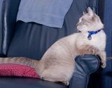
I'm sure Judith will agree with me that this tabbypoint color is extremely hard to expose right! If the rest of the image is exposed properly the cat looks overexposed. I treated this image to a bit of weird unsharp masking (28-3-0) and then open the shadow/highlight adjustment and lowered the mid-tone contrast. That seemed to help. (Doesn't Trinka look like Pogo?) Still not satisfied - too much reflection from the flash on the chair and the cat doesn't look quite right. I went back and adjusted the highlights on the chair with the shadow/highlight adjustment and painted some blue over the strong highlight on the left at 17% opacity. Click on "next".

Canon EOS 20D
1/200s f/8.0 at 40.0mm iso100, bounced Vivitar 283 with Omnibounce diffuser full exif

other sizes: small medium original auto
share
Isabel Cutler16-Jul-2005 02:11
I agree with you, Nancy. This is more accurate...but she still looks too light to me. There's something missing in the dynamic range but I can't put my finger on it.
Isabel
littleheifer15-Jul-2005 18:31
Isabel, I don't mind the flash on the chair and I think the color of Trinka looks better in this one. Very cute capture. She is gorgeous.
Nancy