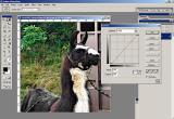
In using curves to adjust an image, sometimes all it takes is the slightest bit
of change to improve the contrast...thus, improve the depth of an image.
In this example, I've moved the lower end of the curve just a bit to the right
making more of the pixels in the image black) and the upper end just a bit to the left
making more of the pixels in the image white). This actually changes the angle
of the incline; the more verticle the incline, the greater the contrast (and vise versa).
Sometimes I just move the bottom and not the top if moving the top would cause areas
to be "blown out".