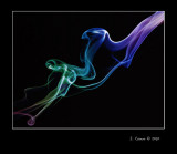
I was asked by the creator of this photo to demonstrate how the photo would look with a larger area outside of the white hairline, and with a larger amount of black at the bottom on the photo, using roughly a 1:1:1: unit spacing of black on the left,top,and right edges,and an approximately 1.5 unit border at the bottom of the photo.
The thread this request was made in is here http://www.thephotoforum.com/forum/general-gallery/196178-kronic.html
Here is quick update to the original. All I did was expand the canvas size, allowing a larger border on the left,top,and right hand sides of the photograph, with each side being roughly "one unit". The bottom edge was given roughly "one and a half" units of black border area, and I pulled your signature downward a bit, and inward just a little bit. it has always been my experience that that professionally matted and framed art done by the most skilled, trained professionals uses a strategy of having a larger or deeper border on the bottom edge of the frame and matte, as a sort of visual "anchor".