photo sharing and upload picture albums photo forums search pictures popular photos photography help login
ctfchallenge | all galleries >> Challenge 129 - Backlighting >> Challenge 129 - Exhibition > Radiance *
previous | next
3/18/07 jstrong

Radiance *

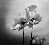
More of an artistic view of the first posted shot...with cloning of the leaves. This was not converted to b&w, rather a hue/saturation/levels/channels mix. I did this one for what has been in my head since I took it. Not sure it was easier pp, as I tend to not convert to b&w but like to work angles around the photo to see what I can get from it. So, in other words, this is totally reprocessed from the original RAW. Anyway...was unsure how anyone would compare it to the first shot. Obviously I like different renditions of this shot. jano


other sizes: small medium original auto
comment | share
ctfchallenge28-Mar-2007 19:22
This shot also looks most excellent in b/w. It gives off a whole other feeling. I would be simply split between this and the color version. I do like the simplified and more close up composition here. For the challenge I do give the color one a bit of an edge since the backlit feature there is more apparent to my eye. In any case, this is one of my favorite photos from your body of work.
-Techo
ctfchallenge26-Mar-2007 16:23
Thanks Sharon for commenting. I like both for different reasons, much as what has been already stated. jano
elips26-Mar-2007 01:30
While I really like the texture of the petals in this one, overall, I like the first one better. ~Sharon
ctfchallenge26-Mar-2007 00:25
Thanks all for commenting. I'm debating sending one to exhib, or maybe not. jano
Bill Warren25-Mar-2007 16:09
Make things difficult why don't you jano. I think this one has improved composition with the loss of the dark lower left elements. With the added fine tuning of B&W shading, this is a rock solid fine art print. But I love more the coloring of the first one.
ctfchallenge25-Mar-2007 11:44
I like the darker background in this more artistic look and totally agree with Jammy on the six feet under feel. Well done. Rich
Rod 25-Mar-2007 06:46
I really like the look of the bottom flower in this shot but as an old romantic I like the warmer tones in the first shot. Nicely done megirl.hic:-)
ctfchallenge25-Mar-2007 03:25
Yes, Jammy - background is linen. The lighting makes for interesting pp for sure. I had to do a pseudo b&w one as the dynamic range on this was good imo. Not sure which one will take the "nod", but some wanted the leaves gone...and I was interested to see what would occur as well. Thanks for commenting. jano
ctfchallenge25-Mar-2007 03:22
Jano this is really interesting.
The post processing certainly makes this a unique one, it almost looks to me like this is printed on linen perhaps?
The vignetting on the side and the overall look somehow remind me of the HBO series 'six feet under'......

- Jamdiver