Thank you Rod :)
I tried to do the partial saturation like MarkJay suggested and after looking at it for a while and the other comments, I decided it wasn't natural or what I saw so I went back to this. Which is why I can't understand with the 'new' digitals why someone would was the 'my colors' where you pick one color and the rest is in B & W. (except for pp purposes) :)))
Rod
29-Jan-2007 06:42
The other partial de sat looked a bit silly but this has some warmth & is much nicer to look at:-)
aam1234 hide | delete 28-Jan-2007 15:53
Not too crazy about partial coloring but this one works. Good one Sueanne.
CTF Challenge PM reply | hide | delete 28-Jan-2007 14:11
This is good Sue Anne! I liked the colored version too, maybe even a little better but I'm not sure. Anyway, very creative and nicely shot! CJ
jstrong PM reply | hide | delete 28-Jan-2007 03:48
Sueanne - wonderful, simply creative and simple. I love this! jano
Guest hide | delete 28-Jan-2007 03:18
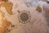
Wow, that compass is really standing out from the rest of the globe now... drawing the eye to it like a magnet! :-) Markjay
CTF Challenge PM reply | hide | delete 28-Jan-2007 03:09
Thank you MarkJay for the suggestion - (thank goodness no layers as I haven't a clue with layers. :) ) so here is another version from the original. sue anne
CTF Challenge PM reply | hide | delete 28-Jan-2007 01:57
Nice, Sueanne. It's a good idea. Wouldn't it be cool if the rest of the globe were in B & W (the rest meaning not the compass). My PS skills are not good enough to get that sort of thing done but, I like your version anyway! Markjay