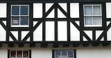
I like old Tudor houses! good patterns and repetition here, but I agree with Christina and CJ, the contrast and sharpening could use a bit of a boost - b.c.
I hope you don't mind but I took the liberty of trying what I suggested out. I added some contrast and brightened it. Then added a medium unsharp mask. See if you like it. I'll take it down by the end of the week.
Hi Pete, I'd love to see this made a little brighter, and have the contrast increased. I think that would really make the dark wood pop out, and the sign in the window too!