Thanks, Neo, Techo and Mary Anne! I have given it one last try and think it looks lots better. Here is the link to the previous version:http://www.pbase.com/elips/image/56916053 Let me know what you think! I am not sure I transferred the comments from the previous version correctly but they are there! ~Sharon
CTF Challenge 11-Mar-2006 03:42
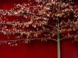
I really like this image just as is, but if you would like to add a touch of saturation and using Photoshop. Just do selective saturation for the reds only, so the leaf tones wont change as much and little play with levels will also boost the contrast if you wish. I tried it, looked great.
-Techo :)
CTF Challenge 09-Mar-2006 19:39
This is better, Sharon, but I think you're right about the lighting being a problem because when you increase the contrast you lose some of the more subtle tones in the leaves.
--Mary Anne
elips 09-Mar-2006 16:27
CJ, thanks so much for trying your hand at this! It is problematic, maybe the fact that I shot it late on a gloomy day is part of the problem. The thing is, I like the way thumbnail looks but then when I open it the image fails to live up to it. You have given me some ideas that I will try later. Thanks! ~Sharon
CJ in CA 09-Mar-2006 15:48
I like the composition of this and the look of the tree trunk and branches against the fence but I think it does need a little more saturation and maybe darkenening and contrast. This is not an easy image to edit Sharon with the red on red! I tried my hand at it and this was the best I could do. Maybe someone with better PPing skills could give it a go! The original is on the left:http://www.pbase.com/cj_in_ca/tree CJ
elips 09-Mar-2006 08:24
Here is the new image. I am not sure I have gotten it right yet. Anyone have any ideas what I should do with this to make it look better? The original image can be seen here:http://www.pbase.com/elips/image/56916053 Thanks for your input! ~Sharon
elips 07-Mar-2006 16:56
Thanks, Mary Anne & aam! I will see what I can do with it! ~Sharon
aam1234 07-Mar-2006 15:34
Love this one, but I'm with Mary Anne, I feel something is missing. Maybe the contrast as MA suggested or maybe up the sat. a bit.
CTF Challenge 07-Mar-2006 15:26
Sharon, I like the red-on-red feeling here, but somehow it looks kind of flat. Maybe you could up the contrast a bit?
--Mary Anne