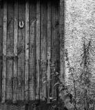
My favorite of the three you posted. I agree with Iso that it needs some more contrast. To do that, you can try these steps
Unsharp Mask: Amount: 16, Radius: 55.4
Selective Color...: Select the Blacks and slide the Black slider to the right to darken the blacks, that works better in some instances instead of just adding more contrast, this way shouldn't blow the whites.
And last but not least, save in sRGB. If not, the photo may look more muted than intended when viewing the photo with various browsers.
Link to a tutorial which contains steps on how to convert to a sRGB color profile.
http://www.dpchallenge.com/tutorial.php?TUTORIAL_ID=26
This shot should ooze character, but it's overall lack of contrast and detail misses the spot. This is the type of image that would lend itself well to mono as a study of shapes and textures but your conversion to mono hasn't brought out these features. It also needs rotating somewhat. Sorry if that all sounds a bit obtuse.