ctfchallenge
|
all galleries
>>
Challenge 84 : Album Covers
>>
Challenge 84 : Exhibition
> Color the Flower *
previous
|
next
21-JUN-2005
RK
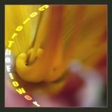
Color the Flower *
Canon EOS 20D
,
Sigma 180mm f/3.5 EX APO Macro IF HSM
1/400s f/6.3 at 180.0mm iso100
full exif
other sizes:
small
medium
original
auto
previous
|
next
Please do not delete, update, or otherwise edit others' entries
* Submitter retains all copyrights *
comment
|
share
Type your message and click Add Comment
It is best to
login
or
register
first but you may post as a guest.
Enter an optional name and contact email address.
Name
Name
Email
help
private comment
Guest
28-Jun-2005 16:32
I like the image but I think the text competes too much with it. Did you try adding the text to the other side?
ctfchallenge
25-Jun-2005 13:31
The curved text works well. But I would like to see spaces between the words. theFly
ctfchallenge
25-Jun-2005 01:24
Well, I was thinking of curves in the font itself, as in a calligraphy script, but this works too.
--Mary Anne
ctfchallenge
24-Jun-2005 22:56
Thanks Mary Anne for the comment. The curved text does look better.
- RK
ctfchallenge
24-Jun-2005 19:50
I like the image and the title, RK, but I think it calls for a font with some sweeping curves to it. Maybe a script or at least italics.
--Mary Anne