photo sharing and upload picture albums photo forums search pictures popular photos photography help login
ctfchallenge | all galleries >> Challenge 80. I Drink Therefore I Am >> Challenge 80 Exhibition > Alcoholic's Lament *
previous | next
04-MAY-2005 Shu

Alcoholic's Lament *

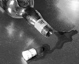
"PUT THE CORK BACK IN THE BOTTLE!"
(Alcoholic's Anonymous (AA) recommendation
for those who wish to get sober.)

Canon EOS 20D
1/25s f/11.0 at 65.0mm iso200 full exif

other sizes: small medium original auto
comment | share
Shu07-May-2005 13:52
Rod - Yipee! I've looked at this over and over and after awhile, and as you well know, you loose your ability to see the image through objective eyes. (I guess this fact ties in with the theme of the image, huh?) Thanks for your important critiques. They have given me more opportunity to work with a difficult image and have provided me with a personal challenge to make improvements. Shu
Rod 07-May-2005 09:43
Bleeding L Shu this is playing havoc with me drinking. Do you keep changing it or am I drinking too much?:-)
I think this might be the one, with less contrast & no rotton partial desaturation.
Now stop it!!:-)
alexeig06-May-2005 07:38
With partial desaturation you either love it or hate it and I belong to the second category
Guest 04-May-2005 20:41
Now it looks better, and I understand the cork meaning, it makes sense... but I feel it is a tad overexposed..the cork looks white... the colored liquid definitely is ok...
ctfchallenge04-May-2005 16:12
This shot is intended to be symbolic...AA often says "Put the cork back into the bottle!" which means give up drinking alcohol. Perhaps this image addresses only certain people and for them, it may have special meaning. My original concent was good but my presentation has gone somewhat astray. I may try the color again. What do you think of the contrast. Thanks, Shu
Guest 04-May-2005 16:03
i have to agree... the cork throws me off. i think the rest of the composition works well. quite gritty.
Guest 04-May-2005 12:27
What disturbs me a little bit is that a J&B bottle doesn't use a cork, but a screw top... then I agree with the first poster, the liquid should have some color, maybe... overall, good idea and nice shot.
Rod 04-May-2005 10:21
This looks terrific in the thumbnail but seems overly contrasty full size, but like Dorys I would have trouble voting for someone who wastes good alcohol:-)
ctfchallenge04-May-2005 03:19
It goes to show that when you step out of your niche it can be difficult! I just came home from work and took another look at this and thought it too light --so----I darkened it. To me it has a rough appearance which goes with the theme, but this style image is really very foreign to me. Please continue to critique if you have any ideas. Thanx. Shu
alexeig03-May-2005 21:59
Nice composition. I am not sure about the light spot in the upper right corner though
ctfchallenge03-May-2005 18:50
i saw your selective saturated version...i think its better this way. -Abstract
ctfchallenge03-May-2005 13:08
Shu, i like the shot but imho as the spilled liquid just seems like water in b&w and hence it does not convey the meaning of the shot for me. may be you want selective saturation (did i just say that?)
if you want to keep in b&w, you might want to add a bit contrast to it. just my two cents. -Abstract