Thanks Andy, I will keep your pointers in mind, if I reshoot this one. They are very helpful.
I had actually shot this last month for a different challenge (complementary colors) Take a look at the original here:http://www.pbase.com/photocat/image/40634000 . The changes I have done is to alter levels in PS for the original. -Cat
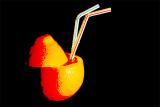
Cat, i like your take on this. Have a play around with it. My feeling is that the lemon is retaining to much of its original yellowness for it to sit right with the abstract nature of the rest of the colurs. The blue straw is the wrong colour IMO. Stick with black white red and yellow or some other main combinatin that can be retained throughout the image.
Andy
Guest
29-Apr-2005 15:28
Rod, excellent point. I agree that this is a good point for debate: a discussion rather than a controversy. I have posted points for discussion on our offical thread. Here is the link to it. Lets discuss it there...
http://forums.dpreview.com/forums/read.asp?forum=1010&message=13297097 -Cat
Rod
29-Apr-2005 05:52
Don't forget Cats photography is good for photographers:-) Imaging is good for commercial artists:-(
The two are getting a bit mixed up these days. This may make a good controversy:-)
Guest
29-Apr-2005 02:31
Sure it works. You need some sort of a surface so it's not floating in air (space) though.