Gday Lucem
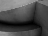
My point about contrast is very minor, if you look at the thumbnail of your image that's how I would like the full size shot to look. The little highlight bottom left & the slightly richer (poss darker) black intersecting the two steps. These two areas look slightly less on the full size shot. It's a terrific shot just as it is:-)
Lucem
04-Oct-2004 02:45
More contrast !!
That was exactly my thoughts when I started processing this image.
If you look the original it look flat in comparison.
I played a lot with curves, streching the histogram to cover all the tonal range.
The problem was that the more contrast the surface started to acquire a distracting texture that would have deviated from the theme on this challenge giving the photo a totally different character.
If you guys are interested I can send you the original RAW file.
This particular image was an enjoyable exploration on tonal correction.
Thanks for your comments.
Guest
04-Oct-2004 00:25
i agree with rod that maybe a little more contrast would be good but i really like the gentleness evoked from the soft curves despite the fact that this is metal.
Rod
03-Oct-2004 19:30
Another well composed image, good shot. Have you tried this with a little more contrast?