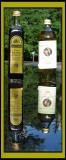
I tried a little selective "burning" in photoshop on the upper white label. It brought out more of the writing and detail. You may want to try it on the original.
Still, it looks good. Have you read Mr. Reichmann's article "Expose to the Right"? Inteesting. Nice pic
Guest
01-Jul-2004 02:10
thanks pops and alexeig for the nice comments and constructive criticism. After I took all the pictures and came in I noticed that the label was overexposed. Details! Looks like I missed that one. -AV
Great reflections and colors. Composition is very appropriate for this format. With a bit more effort you could manage to preserve more detail on the olive oil bottle.
Guest
27-Jun-2004 20:51
The detail in the reflection is almost as sharp as the actual bottles! Wow! Very nice.