Nicely shot ! and I know what you mean about color vs. B/W.
I am glad that you are participating even though this is not your fav topic.
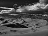
About this zone thing: I think Brent saw it right, sand looks OK to me, but I think the clouds are pushed a tad more towards the black than necessary.
-Cat
Thanks Brent - no, i didn't make any changes. I usually don't care for b&w landscape pics too much because there is no much beauty in the colors. If I saw everything in b&w, I probably wouldn't even think about stopping and trying to capture the view :) But this exercise is fun - I'm thinking the challenge is in trying to capture the right scene vs. tones. Usually the clouds add much to a b&w i'm thinking. jano
Jano, I take back most of what I said in my earlier post unless you already made some changes. I'm now looking at this on my laptop while sipping a wet cappuccino in the coffee house (yum) and it looks much more like "earth" on this screen. My desktop monitor has great color but lousy contrast. I've been holding off getting a new one waiting for a new crop of technology, but maybe I shouldn't.
~Brent
Ah good- the dunes. I think you picked three good scenes to show Jano, and you have several zones in them. But maybe for just me they are pushed just a little too far? Possibly for this one in particular a slightly lighter sky would work and maybe channel sliders or dodging would bring in more varied tones in the sand? Then again others might like them just how they are? :-)
~Brent