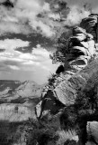
Didn't see the first version but the upper rocks on the right look too contrasty as do the clouds to the left of it. The upper clouds look good & the lower third of the picy is just right. Nicely done mate.
This looks nice too!
Suggestion: The sunlit rock face in the forground is too bright and is distracting (textureless). See if something can be done about it, otherwise it looks allright. Traditional Ansel's work would have darker trees in the foreground and lighter stuff in the background.
-Cat