Very nice, angles and colors.. and how the arm and hammer in the logo seems to be aligned to another grid makes it really stand out.. like a stamp on a postcard.
-k2
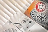
By the way... the light in my laundry room is only half working (needs the fluorescent bulbs replaced) so taking this was a challenge (but it's supposed to be, huh??). *grin*
I ended up getting such a dark box... and fiddling with it. I finally got two flashlights and balanced them in one hand while pushing the shutter button with my other.
(Michael... wanna compare percentage?? I'll take on your Tag 3. *grin*) ~Lydia
Guest
26-Mar-2008 19:48
The lighting here is perfect and the angled framing makes for a great composition.
I've been doing some calculations on the proportion of the space occupied by the Arm & Hammer, Oxy Clean and Whirlpool logos and I'm finding that this image doesn't fully qualify. Collectively the three logos represent 24.63% of the image, but sadly the individual logos do not occupy enough space for this beautiful image to be fully compliant with our taskmasters rules.