photo sharing and upload picture albums photo forums search pictures popular photos photography help login
Canon DSLR Challenge | all galleries >> CSLR Challenge 87: Living Colour (hosted by Gayle Knowles) >> Eligible > the coolest guy on planet earth
previous | next
14-FEB-2007 © Olaf.dk

the coolest guy on planet earth

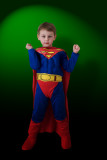
The title refers to the boy's view of Superman, and reflects his self-image, being that super-hero.

Canon EOS 20D ,Canon EF 28mm f/1.8 USM
1/60s f/5.6 at 28.0mm iso100 full exif

other sizes: small medium original auto
share
Guest 22-Feb-2007 20:22
Grant, thank you very much for taking the time, showing me in what direction I could take this. Even if voting is almost over by now, somewhat inspired by your input, I've re-processed the image: darkened the green background some; diffused, lightened and repositioned the drop-shadow a little and darkened the lower legs and boots even further. It's not perfect, but I do think it is better.
Canon DSLR Challenge21-Feb-2007 00:39
Olaf,

I left you something in Pending.

Grant
Canon DSLR Challenge21-Feb-2007 00:27
I've been thinking about this at length Olaf. I think the main problem is that your little guy is lit with a diffuse light but the background seems to have a snoot pointed at it. Since he is casting a shadow on the background, that would imply that the snoot is hitting him too. So that is a discrepancy. Also, I would imaging that there would be some reflected light from the green background visible on him and there isn't. I think this is a large part of why he looks pasted on. Finally, I think he would interact more with the background if it were blue or red. My take on solving this problem would have been to make it more moody and have him emerging from a shadow or something, That way, the background is irrelevant. The idea about the phone booth is a good one too but if you don't have a photo of one laying around, then I guess that is more of a problem than a solution...

Grant
Guest 20-Feb-2007 06:50
Grant, I appreciate your honesty! The asterisk is a thing of the past, so don't let the lack of asterisks hold you back on honest, constructive comments. He looks pasted in because he is pasted in. Do you have any suggestions on how to make it look more realistic? Regarding the background color, I'm curious as to what color you would choose as a backdrop to the Superman costume? A neutral?
Canon DSLR Challenge19-Feb-2007 01:27
I listen to everything Grant says...but I disagree. (smile) Best Wishes, Traveller
Canon DSLR Challenge19-Feb-2007 00:41
Olaf,

I don't see many asterisks in this challenge so I don't know if I'm overstepping my bounds here but...I think the background looks tortured. It appears as if mini-superman is pasted into the photo. I also think the green clashes too much with the costume and is unflattering next to his skin.

Grant
jnconradie17-Feb-2007 22:35
Splendidly done, Olaf. I liked this very much. Regards ~jnconradie
photokhan17-Feb-2007 20:14
The eyes tell it all...It IS, in fact, Superman!
I would like to be the one to tell him differently...
PK
Guest 16-Feb-2007 01:25
I gotta go with Lonnit here - in the sense that it looks like he's standing on nothing and I find it distracting.

I'd actually love to see this shot with a stark street-scene background, maybe even with a phone booth off in the distance (out of focus). He would clearly be the focal point, but it would be more of a "story", if you know what I mean :)
Canon DSLR Challenge15-Feb-2007 22:32
The darkening definitely helped with grounding him. Much better. :) This has also balanced the image enough, now, that I do prefer this crop. My eye goes to his face, glances around, then returns to the face. Well done! ~ Lonnit
Guest 15-Feb-2007 22:14
Lonnit, thanks for taking the time to analyse and share your findings - very much appreciated! You've pretty much just summed up why I went with the crop in the first place - except for the dark at the top, which I put in there intentionally. When I didn't have the dark edge at the top, the brightest area of the background was in the upper left corner and I felt _that_ attracted too much attention and led the eye out of the frame. Regarding him standing on nothing - I've now darkened the lower parts of the the subject in an attempt to make the lighting a bit more believable (better balanced with the background) and his feet more grounded. I think it helped. The previous version can still be seen in the challenge thread...
Canon DSLR Challenge15-Feb-2007 22:02
Lonnit wrote:

The cropped version is better IMO. I don't care for the dark area at the top of the full version, as it draws too much attention to itself, decreasing the ability to appreciate the subject. Once past that, I am further distracted by the fact that it looks like he is standing on nothing. Between the first issue and the second, I can't get a good long comfortable look at his (little) face. So, I say go with the crop - a nice big face with no distractions. :)
If you do go with the tighter crop, I'd crop the background further for a more pleasing composition.
Nice image!

Lonnit
Guest 15-Feb-2007 19:59
I changed my mind about the framing of this shot. The originally posted version (crop showing only upper body) can still be seen in the challenge thread:http://forums.dpreview.com/forums/read.asp?forum=1019&message=22070412
Guest 15-Feb-2007 08:26
Thanks guys! Techo, the background and background lighting are courtesy of Photoshop. In reality he was standing in the window sill with a drab roller blind behind him. Lighting was a simple camera mounted flash bounced off the wall to the left. I hope to reshoot this weekend, as I am not quite satistfied with this myself. Trav, the title refers to the boy's view of Superman, as well as reflecting his self-image, being that super-hero. The words do not derive from father pride...
Canon DSLR Challenge15-Feb-2007 06:43
I'm not sure he's the coolest guy on earth...but he certainly must be among the most handsome. You've got to be bursting with pride over him most of the time. Best Wishes, Traveller
Canon DSLR Challenge15-Feb-2007 01:43
Cute shot :)
Great job witht the lighting. The gradient is a nice touch. Would only suggest the top left corner be green or a more gradual gradient was used.

-Techo
Canon DSLR Challenge15-Feb-2007 01:23
This is great Olaf. Love his abs. Cute boy too. Ann C