This has kind of a sweet nature to it that really attracts me...Still, I find it doesn't really "work", although I can not quite say why...(None of Victor's well-seen points, though...It's something else...)
Curiosly enough, I found (...and still find...) the thumbnail rather compelling...Go figure!
PK
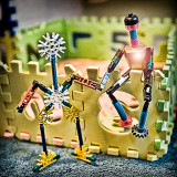
Victor - Firstly, LOL! I'll start by explaining that I wasn't seriously shooting for the challenge. The thing is, I've been sooooo incredibly busy, I've not even held my camera in a couple weeks. Yesterday, I had to move it out of the way to do something, and when I picked it up, I snuggled it and told it how much I missed it. I was aching to use it. Later, I had a few free minutes, finally, so decided just to take a few shots b/c I just had to. When my sons saw the camera, they asked if I'd take a pic of these characters they made.
I was bored with the shot, so just wanted to play with it in post - hence, the processing, which is pretty much a hypersharpening thing. The overdodging, was again, additional playing around. These two characters are apparently in love, so I decided to do a cheesy PS lens flare on the heart, to emphasize it's intense love. That's also where those silly white lines come in. That happened to be the same effect I used in that dining room shot, so kudos to you for the reference! I had stupidly not thought to actually light the candles before taking the pic, so I decided to light them in post. Yes, the effect there was pushing the envelope, but hey, what the heck, it wasn't too bad there - added a bit of glamour to the shot. Here it's all cheeseball and that's what it was supposed to be. Didn't think anyone would take a shot of toys in love too seriously! LOL! ;)
Yeah, of course you're right about the distrations atop, but this particular angel gave a toy's eye view, perhaps as if it were taken by a friend of theirs, which also supports the fact that it's a cartoonish image. So, all in all, it's a grab shot, that was treated as if it were all part of the whole toy theme. I'd never have taken this shot as myself, so it was just playtime all around, not any kind of serious entry.
Thanks for taking the time to do the critique. :) ~ Lonnit
I don't like the processing. Let me share a few things in particular:
* My first impression was that this was a scan of a halftone print with only partially successful descreening. I may just be seeing some sort of moire interference pattern between the print on the puzzle-like pieces and the sensor grid. Or maybe it's an artifact of post-processing. If you know what I'm talking about and can explain, I'd appreciate the explanation.
* The figure sitting on the wall looks overly dodged around the heart area. Was this by design? If so, I think whatever you were intending didn't work.
* Too many sharpening halos. Perhaps that was for effect, but it doesn't work for me.
* the posterization between the sitting figure and the wall on the right is a distraction.
* The two diagonal and two horizontal white lines just look like scratches and don't add to the picture. At least in your picture some time ago of the dining room table with candles that had similar lines, the lines matched the rest of the picture in a way. I didn't like those lines either, but, then, I didn't have these lines to compare them to.
* Compositionally, I find the black piece at upper-left and whatever that is at top, center to be distracting. These might be fixed by changing the vantage point.
I think the concept is OK. I just don't like how the picture was processed.