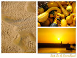
Thanks for the feedback Chris. I was playing with these images on a light table in Apertue and liked how they sat together. The original thought was to advertise the squash, but then I thought how it showed the diversity of the summer suns blessings; food, beauty and a warm place to enjoy them.
So it's an advert for the joys of summer sun.
I thought in addition to the flashes of yellow in the little pools, the ripple above the leftmost pool is a nice analog of the shadow pattern on the off-center squash.
Nicely done, I like how the sand has a touch of yellow in it. The sand image, is the least affective of the bunch, as I feel the dark spots, mostly in the lower part of the image (the blacker spots), distract from the overall flow. Not sure what this is an ad for, but nice.