I would simplify the frame, you have a pixel line on the inside and outside of the black, which I think distracts, then the grey as a shadow and the white around it, just all seems too much. I also think that the thickness of the black seems heavy handed. I would try maybe just the white, like 'old school' photos, or a simple thin black around the image with the white around that, just have to experiment. Chris
Guest
22-Aug-2006 01:57
Oh and I wish you could kinda guide me on the frame, as I put it there to give the hands that 3d look out of the picture like, not sure a more subtle frame would do not even sure of what you have in mind. Sounds good tho and im willing to try it :)
Cherylm
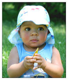
Guest
22-Aug-2006 01:54
Thank you for your comment probably right by all accounts. It was in the bright sun and thus the sun hat in the first place and I really can't change that one but I know it laughingggggggggg. :) Thanks again for the help.
Cherylm
Cheryl, I like this a lot. My only nit on the photo itself would be the white on the bill of the cap, and the loss of detail, otherwise a fine image. Personally I think that this image would benifit from a more subtle frame, the current one looks generic and (imo) cheapens an otherwise fine image. Chris
Guest
18-Aug-2006 19:22
Well, I think it should be very subtle, Cheryl. It works for me. -Michael
Guest
17-Aug-2006 15:16
K Michael, tried several versions of this for ya, sorta settled on this one. Hope you like I'm not sure it made much difference myself LOL. Thanks for the help :)
Cherylm
Guest
16-Aug-2006 05:20
Oh geez, Cheryl, you could crop this down to just the eyes and it says it all. Wonderful. I think you could do a little judicious dodging around the eyes (not the eyes themselves) and make the focus even stronger. -Michael