photo sharing and upload picture albums photo forums search pictures popular photos photography help login
Canon DSLR Challenge | all galleries >> Challenge 69: Greyscale (host: Jim Harrison) >> Eligible > rotten wood and rusted steel
previous | next
9 Jun 2006 Arn

rotten wood and rusted steel

Image has been slightly updated from the original, read more on the comments below.
.
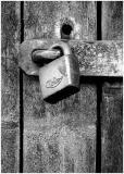
Just a little detail in b&w - the least hideous b&w I managed to cook up. A severely compressed jpg file.
.
The text below is just some after-midnight babling that I wrote while posting this pic. Don't read it.
.
B&w's function (how I see it) in this image and many others - is that it concentrates the attention on the texture/form/lights and shadows.
.
There are in my opinion probably two good general "reasons" for taking/making a b&w image.
1)The first is to concentrate on some aspect of the image by removing RGB information, thus "transforming" the image in to something else from the original. I.e equally good image compared to the color original, just in a different way. There might be a different message in the same image in b&w. Of course, the aim might just be to achieve a certain mood with removing the colors.

2)The other reason is that the colors would distract the viewer from the image's "essential" function and the end result without the colors would be an overall improvent. This kind of image would be an image, that the photographer may very well visualize in b&w already when taking it, only concentrating on the so-called neccessary aspects of the image and subconsciously disregarding the colors.
.
Not to forget: different people have different views about b&w and it's function - "..in the eye of the beholder.." and so on. So, it's useless to go too far in splitting hairs about b&w :)
.
Sorry I had to strip the exif data to fit the image to the 150KB limit. I feel that this is a disservice to many and people should be encouraged to attach the exif information, but the KB limit should be raised so that people don't have to strip everything from their images.
.
Ps. I usually hate writing more than a line or two of text to accompany images. No text at all is a favourite. Ps. Really.


other sizes: small medium original auto
share
Canon DSLR Challenge14-Jun-2006 12:43
I'm so disappointed in myself for not noticing that. But I see it now. Thanks. -- Victor
Canon DSLR Challenge14-Jun-2006 09:52
Ok Victor, it's a very good explanation about CRT and blur and sounds logical. Anyway, we may have been approaching this thing from different directions. What is most important to me - especially when I'm thinking of printing the image - is how the monitor image relates to a print of the image. This sharpness of the monitor image in relation to the print is actually something (that to my knowledge) cannot be calibrated and has to be done by guess work, experience and trial and error.

Btw. Did you notice the easter egg I left for you, when I updated the image? Previously the face on the nail head had a somewhat moody look, but now it is smiling... -Arn
Canon DSLR Challenge14-Jun-2006 00:22
You may call me Vic if you like, but it's a name I hear as someone else's. Yes, I think this is better now. And now I'll explain why I said a CRT effectively performs a blur on the image.

A CRT functions by shining three beams of electrons from three angles through an aperture grill or shadow mask onto a surface that fluoresces (there might be a technical error there, but that's beside the point). The point is that the beam of electrons is not completely sharp. If you were to capture the beam at an instant in time, you would see that the electrons don't all strike at the same point. Rather, they strike an area whose boundary is fuzzy. It's the fuzziness of this boundary that is responsible for the blur.

Additionally, the pixels of the image don't line up with the red, green, and blue dots of the CRT display. This doesn't contribute so much to blurring because the dots are generally smaller than the size of the electron beam.

The amount of blur is dependent upon the resolution the monitor is set at. The higher the resolution, the more blurring there is because the diameter of the electron beam is a greater percentage of the pixel size.

-- Victor
Canon DSLR Challenge13-Jun-2006 22:27
As has been previously mentioned, we aim to humour the audience and so, the sharpening of the image has been toned down a little for your viewing pleasure. I doubt that most people will see the difference though, because it's subtle. People who have taken a _really_ good, may see the difference. Some of those using a CRT might also have preferred the previous version. We are not taking these things seriously though and experimentation is a GOOD thing! Vic (may I call you Vic?), Olaf - how's it looking now to your eyes? :)

Ps. to Victor (and Olaf): Ultimately, a CRT monitor is not applying blur to an image any more than a TFT monitor is "sharpening" or upping the contrast of an image. There is no truth here. If we were all looking at the _same_ image in the _same_ monitor or print - then we could find the truth (for what it's worth). - Yours, Arn
Canon DSLR Challenge13-Jun-2006 19:21
Well spotted Victor - the face looks really sad too! Yes, I know that the image is heavily sharpened and that it doesn't contain many hues - at least hues that are not broken by the pattern of the wood. The lack of hues and high contrast is intentional, but you are probably right that less sharpening might improve the result. Anyway, I know how JPG compression works (your over simplifying a little there) and it doesn't affect what kind of images I make... ;) -Arn
Canon DSLR Challenge13-Jun-2006 17:31
By its nature, a CRT applies a blur to the image, so what you see is softer on a CRT than on an LCD. I'm currently using a Sony laptop using the built in display, which is an LCD screen. But my statement is independent of display hardware. Your image has practically no gradients. An image like this, even with the plethora of detail, should contain gradients, if only at a level of small detail. It is this absence of gradients that makes the image difficult to compress efficiently. -- Victor

P.S. Did you notice the face on the nail head?
Guest 13-Jun-2006 17:23
I was going to say that this looks oversharpened to me and that less sharpening would help you bring down the file size, but then I saw Victor's comment...
Canon DSLR Challenge13-Jun-2006 15:21
No Victor, I don't have another version anywhere at the moment. What kind of monitor do you use? For a high contrast TFT monitor this will surely look different than on a CRT monitor. When I tried viewing this on a TFT (I use a CRT all the time for photography) the image looked very much different, but actually for me even better than on a CRT. Of course monitor calibration also makes a difference. -Arn
Canon DSLR Challenge13-Jun-2006 03:07
In my opinion, this picture is oversharpened. I further note that beside affecting the visual quality of the picture, oversharpening can greatly increase file size. On the other hand, I can see that this image would not compress well. By the way, do you have a version online somewhere that's saved at a quality level you're happy with? -- Victor
Canon DSLR Challenge12-Jun-2006 22:19
All about the texture. :) Now THAT's a good reason for BW. Nice job. ~ Lonnit
Canon DSLR Challenge12-Jun-2006 21:39
This is a really nice image. Here is a little workaround for the EXIF situation...

Post your big one with the EXIF intact and replace it with the small one. PBase will remember the EXIF from the big one.

Grant
jnconradie12-Jun-2006 12:14
Compliments on a beautifully captured picture! Regards ~jnconradie
Canon DSLR Challenge12-Jun-2006 11:11
...sorry about the rant about the file size - even if it's annoying at times, I don't want to blow it all out of proportion either :) Certainly the image needs to have the date and camera used, I just forgot them last night. They are now there. -Arn
Canon DSLR Challenge12-Jun-2006 07:28
Now I see :)

I read and responded to your post in the thread about this. Seeing this shot, I really REALLY feel your pain :)

I've had several this time that just don't look worth a darn at a small enough pixel size to be seen on-screen without panning, and/or don't look very good when compressed down to 150K. And this is odd because one would think that for black and white, we'd have a lot more room to play.

But just the opposite has proven to be true. Never, in color, have I had to compress things so much! I think that black and white is forcing us to really look at the small details in a shot, and in so doing, we're ending up with tons of fine detail that just won't compress down easily. I just gave up on a number of ones that I shot on Friday evening. They'll make (to me) some good-looking prints, but on-screen, and particularly when kept small, they just don't do much for me.

I love to see crisp detail in a shot, but darn, it's been my nemesis this time around!

Ok, now just because the EXIF is not embedded in the shot doesn't mean that you can get away without providing all of the required information. We need date shot and camera used. You can just type that into the proper "slots" in the form. It is automatically sucked up if the EXIF is there, but if not, then you've gotta type it in. Without it, this cannot be entered into Eligible. It would only qualify for Exhibition. Not my rules, by the way :) Jim H.
Canon DSLR Challenge12-Jun-2006 01:09
That is frustrating Arn - I've experienced the same thing in the past. Now squish a 17,000 pixel wide pano down . . . :(