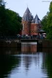
Thank you, Olaf, for clarifying: I had been afraid you meant the word «postcard» in that condescending sense in which many photo-«artists» use it. As far as the red faces go, you're probably right: I did increase the overall saturation of the image quite a bit in order to make the building stand out (and was to lazy to try a selective saturation). — db.
Guest
23-Oct-2005 10:18
Sorry, I was running through the galleries and commenting on a lot of images, and my wording got very brief. When I wrote postcard, that was my first thought on this photo: postcard perfect! The sky/tree line and its reflection, makes an X of leading lines, which leads the eye to the house, and people in front of it. The light is nice and gives the building a warm glow. When I look at peoples faces, they are a bit too saturated red.