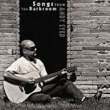
photo sharing and upload picture albums photo forums search pictures popular photos photography help login
Canon DSLR Challenge | all galleries >> Challenge 43: Good Vibrations (hosted by toc) >> Challenge 43: Eligible > Look at me I'm famous 2* Sixth Place (tied)
previous | next
5th june andy syed

Look at me I'm famous 2* Sixth Place (tied)

backyard

iso 100 f/13 1/200thsec 57mm

New and improved thanks to your suggestions and Nancy's fonts.


other sizes: small medium original auto
share
ctfchallenge12-Jun-2005 20:35
Thank you for yur comments and especially Nancy for your font suggestions. Being an honest sort, i'd have to say that the final image was not in my head when I shot. Yes the font selection was after but the use of the dark space was planned. I believe i have added grain in the form of nise already. I usually do this with my not so crisp shots that are b&w/toned.

Re: lighting. This was shot on a blisteringly hot and cloudless day. There is detail that has been given up during processing but that was a conscious choice. The 300D gives me 10secs to press the shutter and be sitting in this seemingly relexed pose. I didn't do it many times! Can you believe I actually shaved especially for this shot. Nw im keeeping the goatee after a couple of years just being lazy.

I will go for a quick reprocess!!!!!!

andy
Canon DSLR Challenge12-Jun-2005 19:22
The "blown" highlights (lets call them high-key, eh?) don't bother me at all for this piece. I agree that some grain would go well here. I like the idea of the added text (cool idea), but I'm not liking the font-- it seems like an afterthought rather than integrated. Aw, what do I know? -- Nancy/odigi
Canon DSLR Challenge12-Jun-2005 19:16
Andy, I really like your "album" cover. :) The words don't distract me a bit. I think B&W was a great choice for this one! -- Jeannie (jburly)
Guest 11-Jun-2005 15:50
One thought: The photography looks a bit too clean given the overall theme. Some grain, perhaps a light diffuse glow off the guitar could add some congruity and additional interest.
ctfchallenge07-Jun-2005 20:07
Rob i agree about the contrast but im not going to redo it because i havent saved the layers. duh. The guitar could be a wise investment, on the other hand, my father did the same 30 years ago ....im a maths teacher. oh well. Alexeig, how could i take offence at such a compliment. Of course the shot is entirely tongue in cheek as was my entry in exhibition. Its a serious attempt at this "genre", but me on an album cover...nah. I really am a bit stuck for ideas as my main props are one gutiar and fields of corn and barley. Incidentally, i cloned the top 3 layers of bricks because this is an old pigeonnaire, a pigeon house, and the doorway is too small to look right.

If i was being serious about myself as a musician i'd take the words off, but as it stands, it spells "im taking the micky out of myself."

andy
Canon DSLR Challenge07-Jun-2005 15:33
Good shot Andy well taken and planned, I take it that is you? One thing that does bother me slightly is the overexposed shirt - or maybe a tad too much contrast between light and black - I like the effect but never know when it is right to use. It is an albam cover shot that is for sure. I have just bought my son a guitar so I'll have a guitar subject as well soon then I'll become their manager and all the riches of the world will be mine I tell you - mine, all mine :)

rob
alexeig07-Jun-2005 15:17
Great autoportrait. I like here the composition, your posture and even the black space except that I would do without the letters on the photo. You have a great appearance for a math teacher, kind of biker type. Apologies if this offends you
ctfchallenge06-Jun-2005 05:30
Good one Andy! -Cat
ctfchallenge06-Jun-2005 00:25
Nice job Andy! I love these album cover type shots. theFly