Oh Olaf, how nice to see this is yours. :) It's a lovely shot. I do find the clarity of the objects in the lower right corner a bit distracting as my eye is drawn to it as if the clarity is supposed to be emphasizing it. That's just a minor photoshop adjustment that would make this really such a nice shot. Good eye. ~ Lonnit
Yes Angela - you convinced me! Well actually, as is obvious from my own comments below, I liked the composition of this one better all along. I was just a bit bothered by the taller lighter pot being soft on its front edge and by the fact that the pot immediately to the left of it, seemed to be even sharper. But if this image wins, you are hosting the next challenge OK? ;-) --Olaf
From: Angela Johnson
Date: 19-Oct-2004 18:57 | delete
Oooh Olaf! You DID put this in! I think it's great! The colors, the tones, the shapes, the wonderful contrast, and of course the shallow DOF all really grab me in this one. I particularly like how the one you've put the point of focus on is also a touch lighter than the rest of them in its terra cotta. A strong composition.
From: Angela Johnson
Date: 19-Oct-2004 18:13 | delete
Oh Olaf, if that other one were mine, I'd definitely put it in Eligible. But that's just me. The pattern and the cluster is just sooooo nice!!
Thanks Angela! I just moved this to the exhibition gallery to make room for another one in the eligible gallery:http://www.pbase.com/cslr_challenge/image/35254700 And THEN I noticed your comment. You are the first person to comment on that other shot... Maybe I should have used that one instead? --Olaf
From: Angela Johnson
Date: 19-Oct-2004 15:02 | delete
Oooh Olaf, I REALLY like the one of all the pots you posted in your comment below.. That's a WONDERFUL shot! This one however, has a more contrasty light that I really like for still lifes such as this. Nice!
Thanks for taking the time Jeff - much appreciated! As is obvious from my own comment below, I wasn't quite satisfied with the composition of this one myself. I did try various crops before posting, but finally decided to go for the uncropped version.
I do see how your crop probably is better compositionally, but it also makes it a whole different kind of image with hardly any repetitive elements - it becomes a trio. As what I was going for was the repetitive elements, the photo I posted in my earlier comment really was the better composition, but like I said, I didn't like the position of the plane of focus in that one, which is why I went with this one instead.
I do believe your crop really is better for this particular photo, even though it does move it further away from my original intentions. So, I have changed it to something very similar to yours. I do not like aspect ratios that are _almost_ square, so I made mine perfectly square. I do feel the little part that's left of the first pot is a plus. I also think that the color is one of the main strengths of this shot, so I didn't make it black and white. For reference here is the uncropped composition:
--
Olaf
From: Jeff Hall
Date: 17-Oct-2004 16:36 | delete
Hey Olaf - I like the lighting, shapes and textures. (*) I'm not crazy about the composition. I played with your image a bit - cropping and converting to monochrome in channel mixer using red 30, green 40, blue 30. What do you think?
I think I might have either stopped down maybe one stop to get more sharpness on the one pot that is in focus, or maybe Lens-Blurred the one at the lower-left where it is trying to get into focus. Nice feel to this image overall. Leaves the mind to wonder what the different shaped creations are for.
-Noel
From: Anna Yu
Date: 12-Oct-2004 21:12 | delete
Ah yes, thank you Olaf, that's much better, very discrete sharpening, but the details in the middle pot can now be seen. I've never used Bicubic .. err whatever it was, just usm, sometimes FM IntellisharpenII. Have to learn Photoshop better one of these days. Great shot, my kind of picture :-)
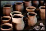
Thanks Mark! Let me share the "behind the scene story" on this:
"Wide aperture" - that's a very open challenge, so as an additional assignment
to myself, I decided to try to mimic some of Anna's excellent shots from Skansen.
We have an open air museum about half an hour's train ride from Copenhagen
and I was hoping to get some shots of costumed people working in old
interiors. Unfortunately, there weren't really any costumed people in any of
the houses, so I didn't get the kind of picture I had hoped for.
My wife was busy with her studies, so I was alone with my son (will be three
on Halloween). He is very much into sticks these days and had found a thick,
3.5 ft long branch on the ground and was carrying it around. He had this
with him into the Potter's house (wouldn't let go of it).
Imagine that - a three year old boy let loose in a Potter's house with a 3.5
ft stick and his father trying to take pictures at the same time... When he
started waving the stick around and up in the air, I told him to please go
outside, which he did. But cheeky as he is, he was waving the stick in the
doorway: "Look daddy, I'm outside, but the stick is in the house!"
Needless to say, my attention was far from 100% on the photography part and
I didn't have a lot of time to experiment with different compositions, points of
focus etc - only got a few shots... Sometimes the challenge is not to get a
good photograph, but to get one at all!
I did get another shot where I liked the composition better, but didn't care
for where the plane of focus had landed, what do you think? --Olaf
From: markjay
Date: 12-Oct-2004 04:37 | delete
Nice colors and visually pleasing, Olaf. Funny thing is, I would have (if I had done this) focused my DOF and lighting on the left front pot as opposed to the middle front pot. However, this does not take away from the fact that you already have a beautiful image here as it is. markjay
Roberta, thanks! Anna, I had used "Bicubic smoother" when down-sampling in order to minimize the noise in the smooth OOF background. I redid it now, using "Bicubic smoother" on one image and "Bicubic sharper" on another, combining the two, masking off the OOF part on the sharper image. While the file was still layered I also applied some subtle USM (amount 200%, radius 0.3px and a threshold of 4) to the sharper image. Better? --Olaf