


|
|
|
|
|
|
| |
| Nov 14 2003 | Mark J |
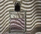
By Mark J
Just another version of my Unbound shadows image.
Would like to see your feedback on this one in
comparison with the other version?
| Guest | 25-Nov-2003 00:06 | |
| Canon DSLR Challenge | 24-Nov-2003 19:16 | |
| Sony Forums Challenges | 24-Nov-2003 18:11 | |
| Olaf.dk | 24-Nov-2003 17:26 | |
| Sony Forums Challenges | 24-Nov-2003 17:26 | |