photo sharing and upload picture albums photo forums search pictures popular photos photography help login
Ray :) | all galleries >> PAD Previous Years >> Daily Photos up to 31 March 2005 >> What I Saw Today >> January 2004 > January 14 2003:
Rockin' Roses Retake
previous | next
14-JAN-2004 Img_0701

January 14 2003:
Rockin' Roses Retake

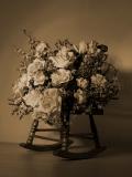
Following Comments from Nikki and Ian I have gone back and re-done this shot. Is it an improvement or not?

Canon EOS 300D Digital Rebel
1/160s f/5.6 at 35.0mm iso400 full exif

other sizes: small medium large original auto
share
Guest 19-Jan-2004 02:46
I prefer this one. Well done.
Guest 16-Jan-2004 00:37
I prefer this one, Ray. It's just beautiful!! Very nicely done!
Guest 15-Jan-2004 20:00
My oh my, what a gorgeous shot!
Ray :)15-Jan-2004 17:19
Well, I am going to have another go and I'll post it as additional PAD at first so you all see it. I'll then move it elsewhere.
Elizabeth Glass15-Jan-2004 16:59
Yes, I like it like this. This is splendid!
brother_mark15-Jan-2004 16:17
I agree with Angela. The original was more interesting. It just needed a little more light in the shadows. I liked the highlights on it much better.
snootydog15-Jan-2004 15:36
I hope you don't mind my saying this Ray, but I liked the original one more. This is very good, but because of the more even lighting, the image looks a bit flatter and the composition looks vulnerably centered which I don't think works too well with the sort of mood your subject and colo(u)rs are trying to create. If you feel like shooting it again try playing with the light a bit more to lighten up the shadows you had on the other one without removing the shadow entirely (IMHO the shadow - though too dark - added a nice complexity to the image). Or maybe for a real experiment you could try shooting this on the bulb setting and "painting" light onto the flowers in varying degrees. I have not as yet tried this approach but I know I am itching to do it with something soon.
Chris Brooker15-Jan-2004 06:08
I think you have cracked it Ray.
It looks good.
Ian Chappell15-Jan-2004 05:29
Have to agree with Angela Ray, a touch of bounced light will help with those dark shadows too.
Guest 15-Jan-2004 04:03
Very nice image...the sepia finish is wonderful and perfect for the mood of the picture. You and I both have roses as our subjects today!
jeanb15-Jan-2004 00:55
I really like the sepia tone for this old fashioned image. Though I prefer the lighting you have on this one, the overall effect is rather too flat for my liking. May I suggest a little brightness and more contrast overall, and perhaps some selective brightness on some of the roses.
Guest 14-Jan-2004 23:50
Actually, I like the other one a little better. It may have been a tad dark on the right side, but I loved the contrast in tones and that beautiful light. This one is more even, yes, but I think it lost something. Perhaps a compromise between the two? If you're not frustrated too much to try again, maybe use the same light you had for the first one, and set up a large sheet of aluminum foil on the right side to act as a reflector and try bouncing some light back into the shadows for a soft fill? You may have to try a few times to get the ratio you like. Just a few thoughts. -- angela :)
Jill14-Jan-2004 23:10
How beautiful!

I have been "playing and playing" with PS to try and obtain this quality.
To no avail thusfar.
Guest 14-Jan-2004 23:03
Yes it's better. There's a bit less light, but it's more balanced.