Simplicity of Image Content
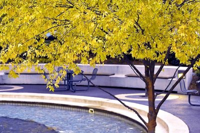 This one is a good example of the thumbnail looking WAY better than the full sized image. At thumbnail size whe really have just a couple of key things...complimentary colors of the tree and background and that curved line. When the full sized image is view, we now see much more "stuff" that does not enhance the image. This inlcudes the pool drain, the partially obstructed tables and chairs, the other competing lines. All of these things are distractions that were not as visible in the thumbnail; and in my opinion make this an unsuccessful image. |
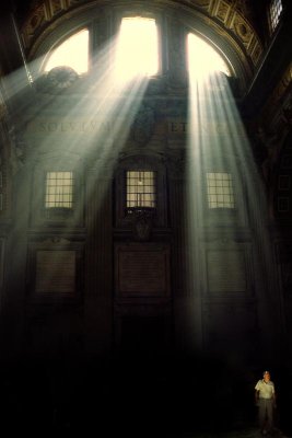 This one is a bit different. In fact, the larger version doesn't really carry a great deal more detail than the thumbnail. So I think this is very effective full size because it's simplicity is maintained. The image is about light, line and form. The man in the lower right is sometimes often not even noticed until the full sized image is viewed. This, to me emphasized the point that little things make all the difference. In this image it's the inclusion of a "little thing." In most images, (like the one above) it will be the removal of the little distractions that makes the image successful. |
click on thumbnails for full image


