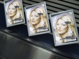
I like the chilly silver and gray that surround the magazine's cover. It hints at the sterility of artificial notions of beauty. The repetition is perfect for a theme about advertising, since those messages are sent at us again and again. These are pithy themes for photographers...vanity, beauty, appearance. You have only to look at the popular galleries to be struck by the amount of effort directed at glamor. Indeed, we do offer the crown to glamor gals...but for oh, such a short amount of time. They might as well be cut flowers.