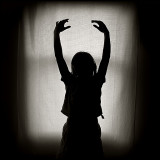
it's a great pose, but I think I would have cropped in tighter...the white background
looks a little bit too obvious, like it's a makeshift stand or something. I agree with Mike
about the white line at the bottom. Other than that, a great idea and well executed.
I like this quite a bit. The only thing I find a touch distracting is that horizontal line of light across the bottom. I think I'd either crop it out or remove it with some photoshop magik.