


|
|
|
|
|
|
| Brian Klimowski | profile | all galleries >> Those Other Special Galleries... >> Taos, in Color and B/W | tree view | thumbnails | slideshow |
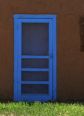
:: Taos, in Color :: |
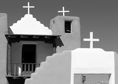
:: Taos, in Black and White :: |
| comment | share |
| Gus Rosenfeld | 26-Jun-2005 02:59 | |
| alex ringer | 25-Jun-2005 10:55 | |