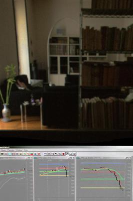
These are the Japanese Candles , a graphic instrument created many centuries ago in the Far East
to monitor the markets prices.
Each candle represents the variation in prices (vertical axis) in a given unity of time (horizontal axis).
The length of their vertical "body" marks the difference between the price at open and the price at close of the given interval of time.
That shows how quickly prices change.
If the close has been higher than the opening the software paints the candle white (prices rising).
If the close has been lower than the opening (prices falling) then the candle turns to black.
It's amazing how these Candles, once drawn on rice-paper, now sparkle and dance real-time
on the monitors of the investors all over the world, revealing the sentiment of markets.
And it's astounding that millions of individuals with their personal behaviour altogether create understandable patterns.
The today Nasdaq chart (- 1.92 %, shot at 1 p.m. NY time) shows a well known pattern,
the neverending novel of the two eternal characters of the markets' scene:
Greed (the white candles, where buyers win and prices rise), and Fear (the long black ones, where sellers prevail, and prices fall).
Fear appears a sentiment much more powerful and violent than Greed, you can see.
P.S. For whom is not expert in those things, the candles above mean a 20% capital gain (or loss) in few hours,
depending on which side of the market you are, the right or the wrong one.
That's not a joke, guys ;-)